This post is more of a “research” note I had while looking into the theme.json file for themes on WordPress 5.8. You can read the introduction post here: Introducing theme.json in WordPress 5.8 – Make WordPress Core or the documentation here: Global Settings & Styles (theme.json) | Block Editor Handbook | WordPress Developer Resources.
What is the theme.json? You can think of it as the style guideline a developer can set for a theme. This file will define what colors the editors will have access to, what font sizes, what type of values can be written and what options different build-in blocks will support.
Why is the theme.json file a great addition?
Gutenberg provides a ton of customization you can add to your blog posts and landing pages. From specific font sizes to margins, line heights, and any of the 16,777,216 the RGB provides. All of these properties create practically countless variations for each component. And this is the bane of any designer — to have no control over what the user sets. A pink button with yellow text for a stylish black and white website? The user can do it. But as designers, we rarely want that, right? Well, this is what the theme.json file does — it sets the rules, and therefore the limitations. Clearly, that’s not all, as developers, we also have to implement it.
What is the goal of the post? To showcase how such configuration can be set in its simplest form. I haven’t yet moved forward to more complex setups or full-blown-out websites, so if this method doesn’t work, I will try to come back and update the content.
A sample theme.json file I ended up with:
{
  "version": 1,
  "settings": {
    "color": {
      "custom": false,
      "palette": [
        {
          "name": "Base",
          "slug": "base",
          "color": "#fff"
        },
        {
          "name": "Base Invert",
          "slug": "base-invert",
          "color": "#000"
        },
        {
          "name": "Primary",
          "slug": "primary",
          "color": "#ec0b19"
        },
        {
          "name": "Secondary",
          "slug": "secondary",
          "color": "#189ba3"
        }
      ]
    },
    "typography": {
      "fontFamilies": [
        {
          "fontFamily": "-apple-system,BlinkMacSystemFont,\"Segoe UI\",Roboto,Oxygen-Sans,Ubuntu,Cantarell,\"Helvetica Neue\",sans-serif",
          "slug": "system-fonts",
          "name": "System Fonts"
        },
        {
          "fontFamily": "Geneva, Tahoma, Verdana, sans-serif",
          "slug": "geneva-verdana"
        },
        {
          "fontFamily": "Cambria, Georgia, serif",
          "slug": "cambria-georgia"
        }
      ]
    },
    "core/button": {
      "border": {
        "customRadius": false
      }
    },
    "layout": {
      "contentSize": "50rem",
      "wideSize": "70rem"
    },
    "spacing": {
      "customMargin": false,
      "customPadding": false,
      "units": ["em", "vh", "vw"]
    }
  }
}
As you can see, the idea is to limit the type of configuration a user has. I have removed the px values in “spacing”, I’ve set the “layout” to em values, removed the border-radius option (as in my testing design, it’s all blocky), set the default fonts, and defined the color palette.
The build-in Gutenberg blocks will parse this file and show options based on this file. An example of a color picker:
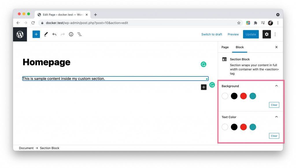
My approach here is to name the colors abstractly – instead of “red” or “green”, I call them “primary” or “secondary”. With this, the color scheme can change without me worrying about reading the wrong names. The same is with the white and black – I have set them to base and base-invert. The base can change to black, and its invert is naturally white. This helps when you define dark mode styles (or just darker schemes).
One note — I usually write primary-invert as well, but I didn’t do it here, because I didn’t find a natural way to set the color based on background (or text) set. My idea was to programmatically set the text based on the background, but this is a bit too strict. So now, the user can set black text on black background. WordPress has method to warn for bad accessibility, I will have to research more on that.
To make reading the code below easier, know that it’s all based on the 10up/wp-scaffold: 10up WordPress project scaffold. repository/setup. Meaning – I am using the same theme from the 10up scaffold and working in its files. I have simply duplicated the example block and began modifying.
The edit.js file
/**
 * WordPress dependencies
 */
import { __ } from '@wordpress/i18n';
import {
	InnerBlocks,
	useBlockProps,
	InspectorControls,
	ColorPalette,
} from '@wordpress/block-editor';

import { PanelBody } from '@wordpress/components';

/**
 * Edit component.
 * See https://wordpress.org/gutenberg/handbook/designers-developers/developers/block-api/block-edit-save/#edit
 *
 * This block only contains background settings, not color ones.
 * The reason is to limit the freedom in order to force the styleguide.
 *
 * @param {Object}   props                        The block props.
 * @param {string}   props.className              Class name for the block.
 * @param {Object}   props.setAttributes          Write to block config.
 * @return {Function} Render the edit screen
 */
const SectionEdit = ({ className, setAttributes }) => {
	const blockProps = useBlockProps();

	const onChangeBGColor = (hexColor) => {
		setAttributes({ bg_color: hexColor });
	};

	const onChangeColor = (hexColor) => {
		setAttributes({ text_color: hexColor });
	};

	return (
		<section {...blockProps} className={className}>
			<InnerBlocks />
			<InspectorControls key="setting">
				<PanelBody title={__('Background')}>
					<ColorPalette onChange={onChangeBGColor} />
				</PanelBody>
				<PanelBody title={__('Text Color')}>
					<ColorPalette onChange={onChangeColor} />
				</PanelBody>
			</InspectorControls>
		</section>
	);
};
export default SectionEdit;
If you’ve worked with blocks before, it’s all clear, but since I hadn’t had much experience before, I will note the main parts:
- InnerBlocks will give you the option to add children blocks. You can have more than one InnerBlocks element per block.
- InspectorControls is the sidebar settings (like the screenshot above, it’s the same). You can have anything here, but it’s best if it’s only for more complex settings. If you just want to bold text, use the toolbar.
- PanelBody is used for these tabs that contain the settings. In the Gutenberg handbook, this is not used and the content was glued to the broders of the sidebar. The title prop is the text next to the dropdown arrow.
- ColorPalette is the set of color options to pick from. This is again a build in component from Gutenberg. Whenever possible, use the build in ones. ColorPalette will pick up the theme.json configuration and only present the colors we’ve defined.
The two onChange handlers are simply there to save the setting to the block attributes.
The block registration looks like this:
/**
 * Register block
 */
registerBlockType(block.name, {
	title: __('Section Block'),
	description: __('Section wraps your content in full width container with the <section> tag'),
	attributes: {
		bg_color: {
			type: 'string',
			default: '#ffffff',
		},
		text_color: {
			type: 'string',
			default: '#000000',
		},
	},
	edit,
	save,
});
I have some more code (includes only), but this is the meat of it. I haven’t thought of the smartest way to approach the attribute default values yet. As far as I understand, it needs HEX values, not CSS Variables to actually setup the circle colors.
Output the markup
The trick here Is to NOT do the default static block approach but instead use a dynamic block. Meaning – do not return JSX in the Save, just return null. In my case, I am returning the inner blocks:
const SectionSave = () => <InnerBlocks.Content />;

export default SectionSave;
In the registration of the block (this is the PHP side), it looks like this:
/**
 * Render callback method for the block
 *
 * @param array  $attributes The blocks attributes
 * @param string $content    Data returned from InnerBlocks.Content
 * @param array  $block      Block information such as context.
 *
 * @return string The rendered block markup.
 */
function render_block_callback( $attributes, $content, $block ) {
	ob_start();

	get_template_part(
		'includes/blocks/section/markup',
		null,
		[
			'class_name' => 'section--fullwidth',
			'attributes' => $attributes,
			'content'    => $content,
			'block'      => $block,
		]
	);

	return ob_get_clean();
}
It’s probably time to mention this – the block I am working on is a reusable section block that only wraps the content of the site. It gives the ability to the editors to set full-width backgrounds, colors, images, and separators, but nothing more. All the content is a child of the section.
So, since we are not doing it in JS, we are doing it in PHP – a dynamic block.
<?php
/**
 * Example block markup
 *
 * @package TenUpScaffold\Blocks\Section
 *
 * @var array $args {
 *     $args is provided by get_template_call.
 *
 *     @type array $attributes Block attributes.
 *     @type array $content    Block content.
 *     @type array $block      Block instance.
 * }
 */

// Set defaults.
$args = wp_parse_args(
	$args,
	[
		'attributes' => [
			'bg_color' => '#fff',
			'text_color' => '#000',
		],
		'class_name' => 'wp-block-tenup-section',
	]
);

// Overwrite the section color setting based on Gutenberg attributes.
$block_style_properties[] = '--c-section-bg:' . $args['attributes']['bg_color'];
$block_style_properties[] = '--c-section-fg:' . $args['attributes']['text_color'];

?>
<section
	class="<?php echo esc_attr( $args['class_name'] ); ?>"
	style="<?php echo implode( $block_style_properties, ';' ); ?>" >

	<?php echo $args['content']; ?>
</section>
I have some concerns about the quality of my PHP code here, but it did the job for now. What is going on:
- In the attributes I am setting default values. I am not 100% happy that they are hardcoded however and this might need some future research.
- The $block_style_properties[] array contains all the color settings in the form of CSS Custom Properties. The CSS variable name is the same that I use in my CSS file. It takes the value from the attributes in the form of a HEX color.
- Then in the section below it’s all outputted in one HTML tag with class and style as well as it’s inner content — the blocks we nest.
Styling it in CSS:
The colors.css file has a simple :root definition with CSS properties inside. My idea is to NOT set color properties there but instead pull the colors Gutenberg will generate for us based on the theme.json file:
/*
 * Colors
 */
:root {
	/**
	 * Base and Invert are a pattern that works with both light
	 * and dark color schemes. Invert is color that contrasts with the base.
	 * Both come from the theme.json file
	 */
	--c-base: var(--wp--preset--color--base);
	--c-base-invert: var(--wp--preset--color--base-invert);

	--c-primary: var(--wp--preset--color--primary);
	--c-secondary: var(--wp--preset--color--secondary);
}
You can read more about this in the theme.json handbook. When I refer to my theme-specific variables like —c-base, I simplify it a bit in its name, but the value itself comes from WordPress. I believe it would be perfectly valid to just use the WordPress variables here. My only concern is that I feel like having less control over the WordPress values as they can be changed from plugins, blocks, themes, probably users in the future.
In summary
The theme.json file is the missing part for me to adopt Gutenberg fully for site editing. Now that it is here, I think there is no need to worry about failing style guides, messing up buttons, writing silly values (like padding 8px 17px) instead of using pre-defined values that look good.
I am 99% certain the approach above is not perfect and has holes, so I will continue building with it and modifying it and ideally post a follow up 🙂 Cheers!