HTML and CSS (just the two, yes, classic front-end stuff) are often overlook in favor of JS. Many developers reach a point where they understand the base concept for layouts, standard styling properties and the way to build elements. Often accompanied with a library like Bootstrap or Foundation.
But it turns out that there is a lot more to building layouts than just that. In fact, it’s rather easy to spot the TON of badly written front-end code. Its truly rare to see a project where things make sense, there is no useless properties, overly-complex stylings and hacks left and right to solve problems caused by bad code in the first place.
More than once I’ve deleted 300+ lines of code to write 50-60 lines that do the same job with less bugs and it’s easier to understand.
So, if you think that there is still some room to grow, try out the following projects in your spare time! Note, the order is not in terms of difficulty or anything.
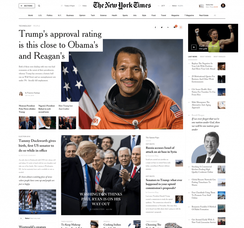
1. The New York Times

You can find the design in Slava Kornilov`s Behance page.
What is the trick here – The pages are rather big. Quite big in fact. And you only have a photo to work with, not real design files. So you have to trust your eye – find fonts, copy-paste some titles and content to see how it would look. Make it functional with variable title length ideally.
There are a few pages, pick just one and build it all. Then do the tablet and mobile styles. Bonus points if you make it load nicely – lazyloaded images, swap fonts etc.
There are a few heading styles as well, you can add one of them as well. One more thing – the design page showcases a huge collection of views. It’s amazing! So don’t stop at just one, you have plenty of designs to work with for weeks.
Deliberate practice always prevails! Here is a list to keep in mind and strive to follow each suggestion for all of the designs below:
- Consider the naming – Create a ruleset for your class names and follow it.
- Work in components – Everything has to be reusable as much as possible
- Responsive – Obviously, the site should work well on all devices. Even if you don’t have the designs, try to figure it out.
- Pixel perfect – You might not go pixel perfect, but try to be as close as possible to the designs. In the end, it should be almost impossible to differentiate the two unless you compare them.
- Clean code – Must do – nice indentation, good formatting. Setup some linter and follow it. HTML and CSS – both.
- No unnecessary code – Do not write code that does nothing or is overwritten as much as possible. If you overwrite, it’s most likely a modifier. If you see a lot of related overwrites something is most likely bad.
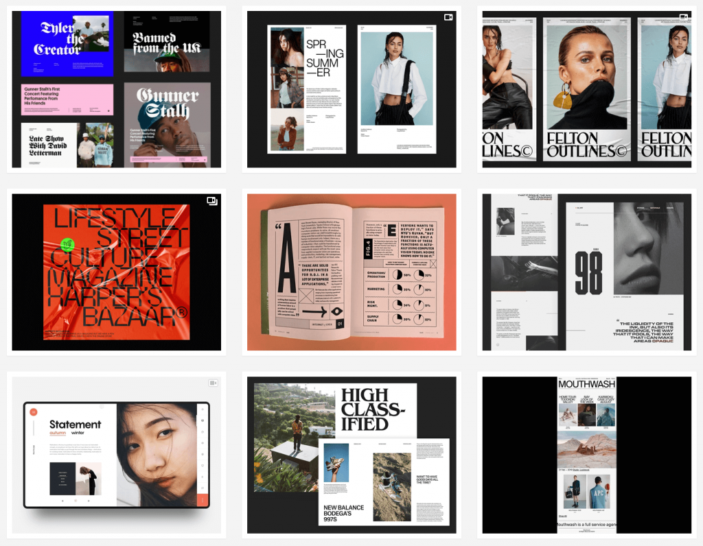
2. “Designer” landing page

You can find it in Dribbble.
The thing here – it has to also work somehow on larger desktop views. Also to follow the same style, order of elements etc. Most likely grid would work well here?
There is also touch controlled slider, so you will have to add some more JS to make it work well on all viewports.
The last section with the images is also one of the trickier ones
Bonus – there is also this one that is a nice practice. it has some trickier elements + the animations will take some time as well to perfect.
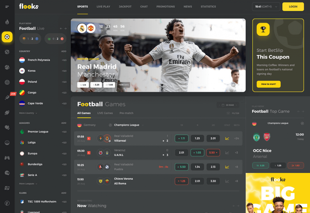
3. Dashboard design

You can see full design here.
Of course, you can grab ANY dashboard design you want, but ideally try to find something bigger where you have to reuse similar components across the views. That way you have to think about the styling of these elements in various areas.
Nice structure (both in naming and in files) will help you out with the code and support for the whole dashboard.
Again a reminder, you don’t have to go with the design above, just find anything rather big that showcases different elements and views and implement it. Bonus points if you can design your own and release it as a freebie 🙂
4. Print layout

This one is not about print-print, it’s about writing print-like layout for the web. How do you make it work? Is it per page or two pages on the viewport? Up to you! But the end goal is to figure it out and apply the same rules as print magazines have been doing for decades.
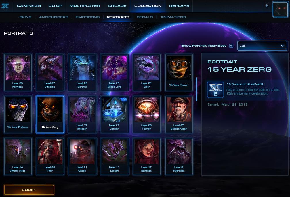
5. Game UI

StarCraft 2 has some great UI and it’s something you can try to implement in HTML and CSS. There are no assets to use here, so it will not be 1:1 for sure, but try to be creative with the code and go as close as possible. Assets for images can be easily found or you can even just screenshot them.
I once redesigned the League of Legends screen and went for HTMl/CSS implementation, which was some great experience. Total work time was about 6 hours.