It all started in my school years when I and my buds were playing together online in the hours after school till midnight (and after more often than not).
Now, I wasn’t a hardcore gamer, not even close, though I could say that I am more or less proud of my “Global Elite” rank achievement on CS:GO.
So it was then when I stumbled upon League of Legends – an MOBA style game by Riot Games – a game with more than 100 million active users each month!
So you can see how quickly I got addicted to it, hitting hours and hours every day. In case you don’t know it (or the MOBA genre in general) it’s a team based 5v5 game where each player controls a champion with a set of unique abilities.
I won’t get into details about the gameplay as this is not the goal of this writing, but I must say a few general words to explain it better anyways.
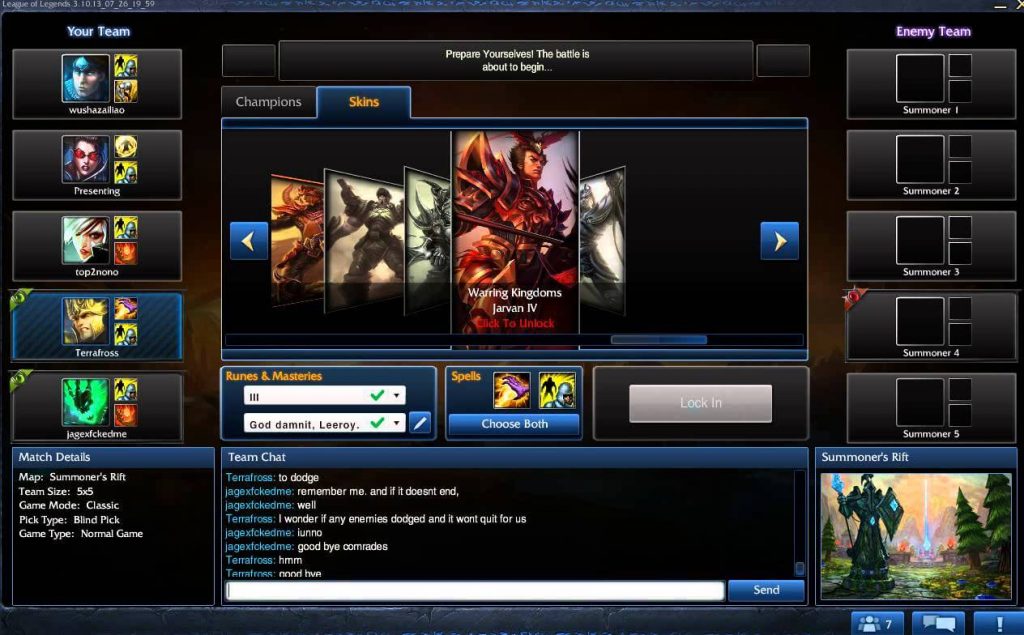
The old champion select screen
So from a user’s perspective (the player), there are a few core stages to play the game.
- Open the game launcher and set the game mode you’re playing on, build a team or queue solo or with a friend
- Once all players for the game are found, start selecting your champions.
- Launch and play the actual game.
At the time I was playing the game, step 1 and 3 were quite polished from the game makers.

What wasn’t looking good however was the champion select screen. This is the place where each player picks his champion, chats with his team and select his set of “special spells”. It is a non-fullscreen window in which everyone stays between two and five minutes (and doesn’t play, duh..).
This is how it looked back then:

And it did its work, millions of players used it without any big struggles, while the UI felt old and unpolished, the UX of it was spot on, no one complained too much (unless brought the topic).
The plan for the redesign was simple and the rules – easy to follow.
I can say that I was okay with the current select screen for the very long time. Didn’t even bother too much. That is until I browsed dribbble and saw a bunch of shots of people redesigning popular products.
Shortly after I launched LoL (League of Legends) and the champions select screen reminded me of those redesigns, for the first time I actually noticed how bad it looks compared to all other visual updates going around the game.
I couldn’t wait to finish the current game and fire up my old buddy Photoshop and start drafting some ideas for a possible redesign. I didn’t even look around if someone else tried to do something like this before, it didn’t cross my mind.
All I did was to open a screenshot of the champion select screen Riot was using back then on one monitor and Photoshop on the other and started reworking the UI a little. I had a few general goals:
- Don’t make it too different from the current one.
- Make it easy to code.
- Stay close to the rest of the UI.
I should give a few more details about these goals. The first one was because of the huge player base. If that design was in real use, most people would complain very hard about all the changes like “Why is this removed” or “Where is that thing” or even “I liked the old one much more”.
People don’t like the unknown, the different. Change is difficult for many. I wanted to give a fresh new look and keep the old UX more or less. It wasn’t a huge improvement to the flow, it was more or less building on top of an already working select screen. If I had to label this, I would say it is a “remastered” version of the original one.
The second goal was no brainer to me. I know that writing this type of UI can be really hard sometimes. I remember how my classmates were struggling to implement a very basic UI in languages like C++ or Java back in school, so I knew that I shouldn’t go all too wild on this as well.
I also have this habit from web design anyway, more often than not I am the one who codes the designs, so I don’t want to punch myself in the face with something that would be a nightmare to code and maintain in the future. Afterall, these changes happen once in every 3-6 years or so.
The last third one was also common sense. Riot has already started introducing UI changes to their game. One was the initial launcher screen with all the recent news, game modes and all and second was the game itself.
And they did a really damn good job with all of this in my opinion.I went for the same look and feel for this champion select screen of mine.
The day I reached Reddit’s hot page
So after two quick hours, I was ready. And I liked the result. Honestly, this was my first time redesigning game UI and one of the very few times I was doing dark themed UI. I find them more challenging for some reason.

Before leaving the PC and going for a stretch and some quick meal, I decided to go YOLO and submit the redesign to LoL’s Reddit page (which has quite a lot of readers tbh).
The thread I created was this. Back then it had 1 upvote, 0 comments and in the “new” section. When I came back from the living room and refreshed just out of curiosity, I saw a few hundred upvotes and a bit less comments already in place. And that was just so awesome!
I quickly started reading all of the comments and answering to every single one of them. Believe me, it was the first time I saw so many responses to my work and it was worth every second put into designing the screen.
The best thing of all was that nearly all responses were positive. Words like “looks good”, “looks very fresh” or even “Damn this looks amazing. Way better than original champion select screen IMO.” was just too good to be true.

In the middle of many of them, there were so many awesome people replying about how would they improve my design even more. And to be honest most of them were very good ideas coming from players with much more experience and knowledge in the game.
So I took the ones that sounded most reasonable in real life and placed them in the design. I started adding links to every new iteration in the thread and commenting back to their suggestions.
Some players suggested improving the fonts I’ve used as they were hard to read. I thought that there is very legit reason to listen to them, the game has to be useful to all players as much as possible and accessibility is a very high priority in this scale of usage.
The next day I did the same. Differently.
I saw how people liked it. It hits like a train; the motivation that is, of course.
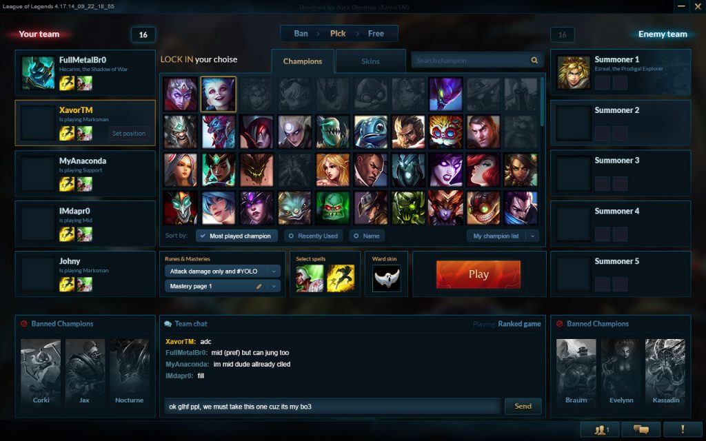
So I did the select screen with all champions listed in it. This one had a bit more components to it and a few more ideas of mine.
It was something that bothered me for quite some time when using the original select screen. It was hard to get the champion I want to the current game. Really, there are over 120 champions, finding the exact one is not always the easiest thing especially when you have a time limit.
Really, there are over 120 champions, finding the exact one is not always the easiest thing especially when you have a time limit.
My solution was to add a very often used feature in such cases – filters. The only existing filter at the time was a search bar. But that means that you have to memorize the names of all 120 champions and unless you’ve been playing the game for half a year or more that would be troublesome.
So I added a way to sort the champions by “most often played”, “most recently played” and by name for a consistent look. Next to that, there is a dropdown for your own custom “playlists” of champions to pick from.
The thing with the game is that there are roles in every match and each role has specific champions to play with. A marksman uses a set of champions, the support has others. Every player can list the champions that fit his needs most and add them to these playlists to pick from.
During the whole proccess, I was browsing all the comments from the previous thread and thinking which suggestions are the best and how to implement them in the design.
The final result was this:

And this was the thread it was posted in. This one had a bit less traction, but it was also something more familiar to the regular Reddit users, so they were less open to it. And that was perfectly fine, I’ve would react the same way.
This one though in my opinion was a better design. Here too I tried to answer to all questions and feedback from the players as honest as I can.
Maybe one of the more important things that happened was that I managed to receive and utilize a lot of critical feedback from the end users of the product. It was more than I could ask for.
9 months later
The thread was dead, the design—more or less forgotten.
But funny enough, the same spark reminded me of it. Seeing a challenge to code a concept from dribbble posted somewhere in Medium made me think “What if I coded that redesign I did back then?”
And this was the best timing to do it, it was the same week when I first saw Livecoding.tv, now liveedu.tv.
I setup my machine for streaming and described what I was about to do as close as I can on the stream page. Fired up everything and started coding the design from the ground up.
The first five minutes there were more than ten people watching, which was way too much if you ask any first-time streamer. Numbers like one or zero are much more normal.
Half an hour in I had over 100 viewers. About the total number I had from streaming CS:GO on twitch for a month.
The reason? The title. “Coding League of Legends champion select screen”. Some might have even thought I was a Riot employee. Huh…
During the whole streaming, there were countless questions, it felt like AMA more or less. Many were not even related to what I was doing at the time but more of an advice for their projects.
What was, even more fun, were the times when I struggled with some element, positioning or JS function.
I guess it’s time to note that what I was coding was plain HTML and CSS, no actual programming except for a hundred lines of basic jQuery triggers.
And me, the fool, asked the viewers for some help. Guess what the answer was…
“We’re here to see you struggle, you peasant.”
Well, maybe without the last part, but close enough. How not to love the community, right? Well, I struggled for the spectators, and I made it work. With the help of one or two guys that saw pity in poor me though, but it worked nonetheless.
What’s more is that I kept all the recordings of the streaming and bundled them together to form a time-lapse of the whole project. Something I’ve been wishing to see on YouTube a few years back. It’s more than an hour and a half, so you can really see every line I put there if you’re curious.
And this was the end of it.
More than two years later the Reddit thread is long forgotten, a few related posts in other forums were added, but also forgotten.
My stream has been dead ever since, though every now and then a new subscriber comes and asks when will I stream again.
The demo link is sitting quietly as a portfolio of not so great, but working code.
And that’s normal. It was a one-time thing, planned and executed as such. Since then I didn’t make many redesigns, most of my work was on the client projects at the place I work. And believe it, they are much more challenging than the LoL champion screen.
There is a very simple explanation to this.
- On a client project, you have deadlines.
- You have a client with requirements that must be followed
- You work in a team and have to sync with everyone
- The projects are always much bigger
- The feedback is limited to your QA team and the client during the development stage
So the LoL select screen was a great experience and I am so grateful to all positive and negative comments from everyone on Reddit, I made sure to read all of them carefully and see what can I improve in my future work.
It was a boost of self-confidence and a way to test my skills. And thanks to Riot for their actual real redesign that came a year or more later I saw how far off I was from their plan.
All of this is a way to learn. I would suggest the same thing to every front-end developer, every designer, every writer or back-end coder. Do the things you love as a side project, share them, get feedback. Think about popularity, think of usability and how needed a thing is.
Every day something goes viral, next one could be yours!
